Monday, February 25, 2013

Sharon Butler: Precisionist Casual at Pocket Utopia

By Pocket Utopia's entrance, right: small beauties. The exhibition title conflates the precisionist approach of early modernist painters such as Charles Sheeler with a recent focus on (de) material and (non) finish, in what Butler dubbed New Casualist.
Finish becomes a gestalt of the whole, bringing all elements into play, those surrounding as well as in the work. The ruddy, exposed stretchers against cool-hued shapes and linen create a frisson between texture and material. The bottom thread of the canvas became a gorgeous, pivotal element offsetting the weave, geometric elements and color blocks in this painting.
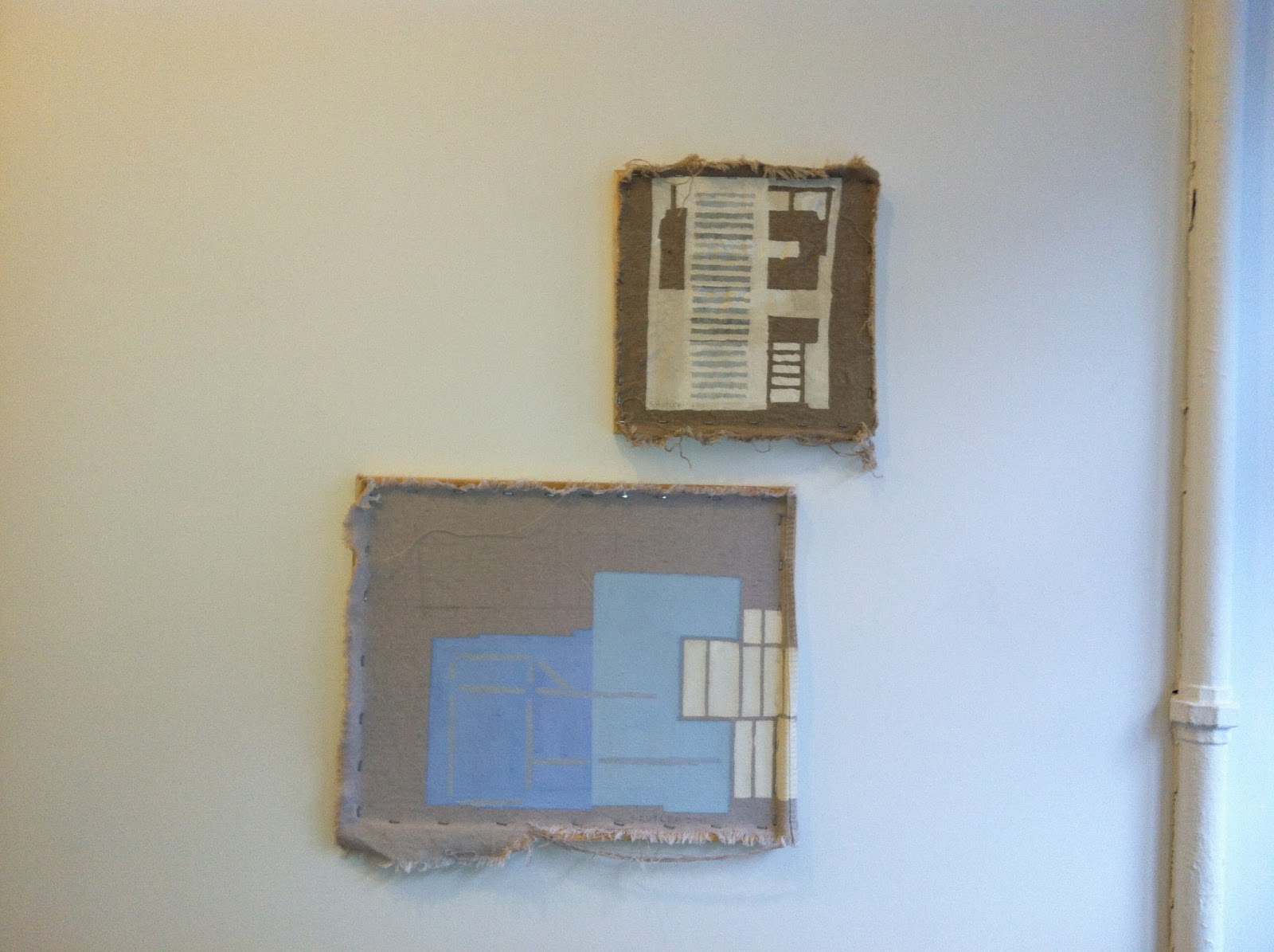
A view of the show for scale and sequence. Note wrinkled edges--becoming formal elements within the work.
Definitions of finish and painting are challenged within a simple decision to stretch or not stretch canvas.

More color-in-material. Butler's signature is included as a visual element.

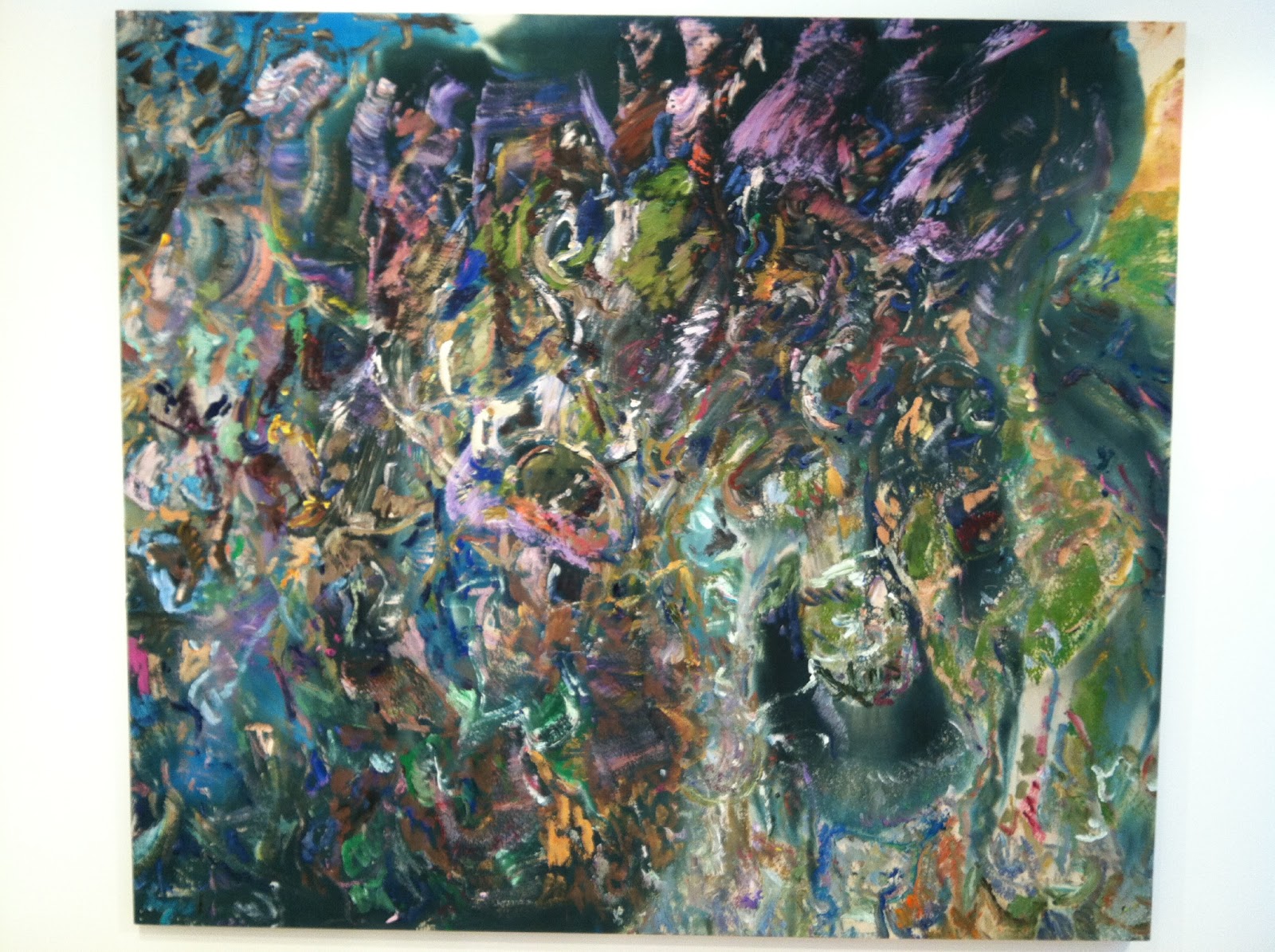
More traditional than others but smoky and beautiful.

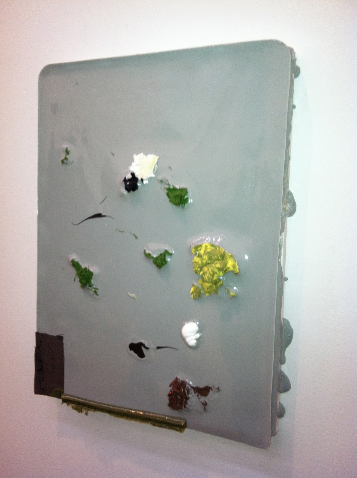
Metallic paint and staining. Immersed in historical and contemporary applications of pouring paint,
I can't help but love this one for its lightness and historical referent. Recently Stephen Maine attributed staining paint to both James Brooks and Helen Frankenthaler. Staining engages the fusion of surface and ground, sought after in late modernist painting. Butler's painting adds urban concerns such as graffiti, sealer and the industrial shapes one espies on a rooftop.


The corners feel nearly overdone yet without them, would the painting address the same issues?


Butler's exhibition is also featured elsewhere:
Joanne Mattera
http://joannemattera.blogspot.com/2013/02/canvasing-neighborhoods.html
and
Thomas Micchelli for Hyperallergic
http://hyperallergic.com/63349/when-paintings-come-apart-sharon-butler-on-the-inside-out/

Congratulations, Sharon Butler!

Tuesday, February 19, 2013

Juicy Paint

Brett Baker at Elizabeth Harris: DETAIL of his work's thick, striated surfaces and surprising color shifts

Missed his recent show but two paintings hung by the desk at the gallery.
The red one was equally beautiful with hints of copper, but iPhone couldn't pick it up.

Josette Urso at Kathryn Markell, a joyous exhibition. Urso's beautiful view in her Bushwick loft inspires her surprising tonal shifts and plays of the brush. I enjoyed the strange, cool color of this painting.
See another Urso if you scroll down.

Peter Wayne Lewis, who divides his time between northeast US and Beijing, in the 2012 Beijing Biennial.


The real thing at Skoto, also on 20th St. Skoto was a find: it features Jamaican artists' work.
The vibe was Salon-like, with conversations blooming in all directions, which is why I didn't photograph more.
Lewis works large, sometimes serially and there are also some lovely watercolors in back.

Inspired by and erudite in jazz, Lewis' marks suggest Chinese ink painting.

What in Chinese calligraphy is referred to as a "crossover"--
the brush jumps over paper to get to the other side of a mark, Lewis achieves with a scraper, it looks like.

Cora Cohen at Guided by Invoices, at the corner of 21st and 11th. What an absolutely gorgeous show.
iPhone photos can't do justice to the subtle, swiped surfaces and layers of graphite and oil.

Josette Urso at Markel: a buoyant snow painting with odd, checkered lozenge shape.

Preview of Jennifer Wynne Reeves at BravinLee Programs, a quirky, intimate and beautiful show.

Cora Cohen: ruddy painting, with gold and copper notes.

Jennifer Wynne Reeves: relishing material.

Fearless navigator of all things visceral.


And again.

She's been working on these paper pieces for a while.


Raggedy Ann's Foot will need to migrate to a new server. Until then patience is appreciated.

Warm and Cool in Chelsea and Midtown

 Deep Cuts at Anna Kustera
Liz Markus at Deep Cuts, curated by David Humphrey and Wendy White at Anna Kustera on 21st St.
Read more about it, and see the full show, at the link above. Plus, good curator photos at KCLOG (link to right on this page).
I love this image in tandem with Morris Louis and the Kasmin show in the previous post.

Peter Saul at Mary Boone on 57th.
I have loved his work since his 2010 survey at Haunch of Venison, which featured crazy, ambitious history paintings.


Nikki Maloof at Deep Cuts

More Saul...can you imagine.

What makes these images so pungent are dainty, methodically applied marks and internal scale at a perfect pitch.

Down the hall at McKee, a Guston drawing and painting.

Harvey Quaytman at McKee.

Blogger no longer loads images in order. So here is Saul--a particularly beautiful one.

The detail of Quaytman that wants to accompany the image of his painting.

Saturday, February 16, 2013

From Color Field to Figure: a Friday in Chelsea

Kenneth Noland at an amazing group show on 10th Avenue at Kasmin.

Helen Frankenthaler. Working her stain technique with new-at-the-time acrylic.

Frank Stella. Sumptious, subtle color passages.

Frankenthaler at Kasmin.

Julies Olitski: "paint suspended in air," his vision realized by airbrush.

Morris Louis. The late pour paintings--made in a small apartment. Almost like Chinese painting.

Morris Louis again--at Kasmin.

Detail, Louis, left side.

Translucent detail, upper Louis, right side.

Larry Poons at Lauretta Howard/Danese. Look at those pours upper left! Dynamic marks balance throughout.

What an amazing group of paintings! Poons, following his own path.

A fractured mark reminiscent of Cecily Brown, but pastoral landscape as well.

One feels weather, temperature, density--yet there is no overt image.


Poons works on top of pours, to ravishing effect.

Transition: Shinique Smith at James Cohan: light brushy paintings, almost like drawings, with hanging laundry sculptures.

Charlie Roberts at Kravets Wheby.

Crazy moves but they fall together in a way that feels real.


Lower left corner a ravishing compilation of marks and form.

Peter Williams at Foxy Production. This, a limpid, gorgeous painting--the surface is lovely.


More Williams, opaque and transparent mixing with inventive, almost Imagist shapes.

A new delicacy of touch in Williams.

Taking the biomorphic shapes up front into small, private ruminations in the back room of Foxy Production.

Color miracle--180 from Color Field, yet a spareness and restraint reminiscent of that time.
It was a beautiful day. More images to come.